Making a customizable turn-based combat game in two weeks
For the last two weeks I’ve been working on my entry for the Kaiju Jam, Kaiju Klash, which is a turn-based combat game based around building your own giant monster from a variety of parts to get different stats and abilities and pitting it against increasingly difficult opponents over the course of 10 rounds. Here’s a few rapid fire takeaways you might find interesting or useful from my experience.
Gameplay
The gameplay is fairly standard turn-based combat with the main hook being the combination of different monster parts together to reach your goals. Want some more defense? Maybe replace the robot legs with lobster legs. Want to be more evasive? A squid part could be the right call. The distinction between monster types isn’t always as strong as it could be, but I also don’t think any monster type is so egregiously far off that you have to always use it or avoid it to win.
Which leads me to another major point: balance. Balancing this game was a lot of work, and there’s still a lot of work that could be done in that area. I knew balance was going to be important for a fighting game, but considering there aren’t that many combinations of monsters and parts, I was hoping it would be a bit more straightforward than it ended up being. In the end, I did find that using a classic exponential curve to scale both enemies and the stat effects of parts helped to provide a good sense of progression to the game, making each new level of combat or upgraded part feel significant over the last. The balance can be a bit wobbly in places since it’s easy to end up with a few rounds that are too difficult or too easy, but ultimately the curve seems to work itself out.
Artwork
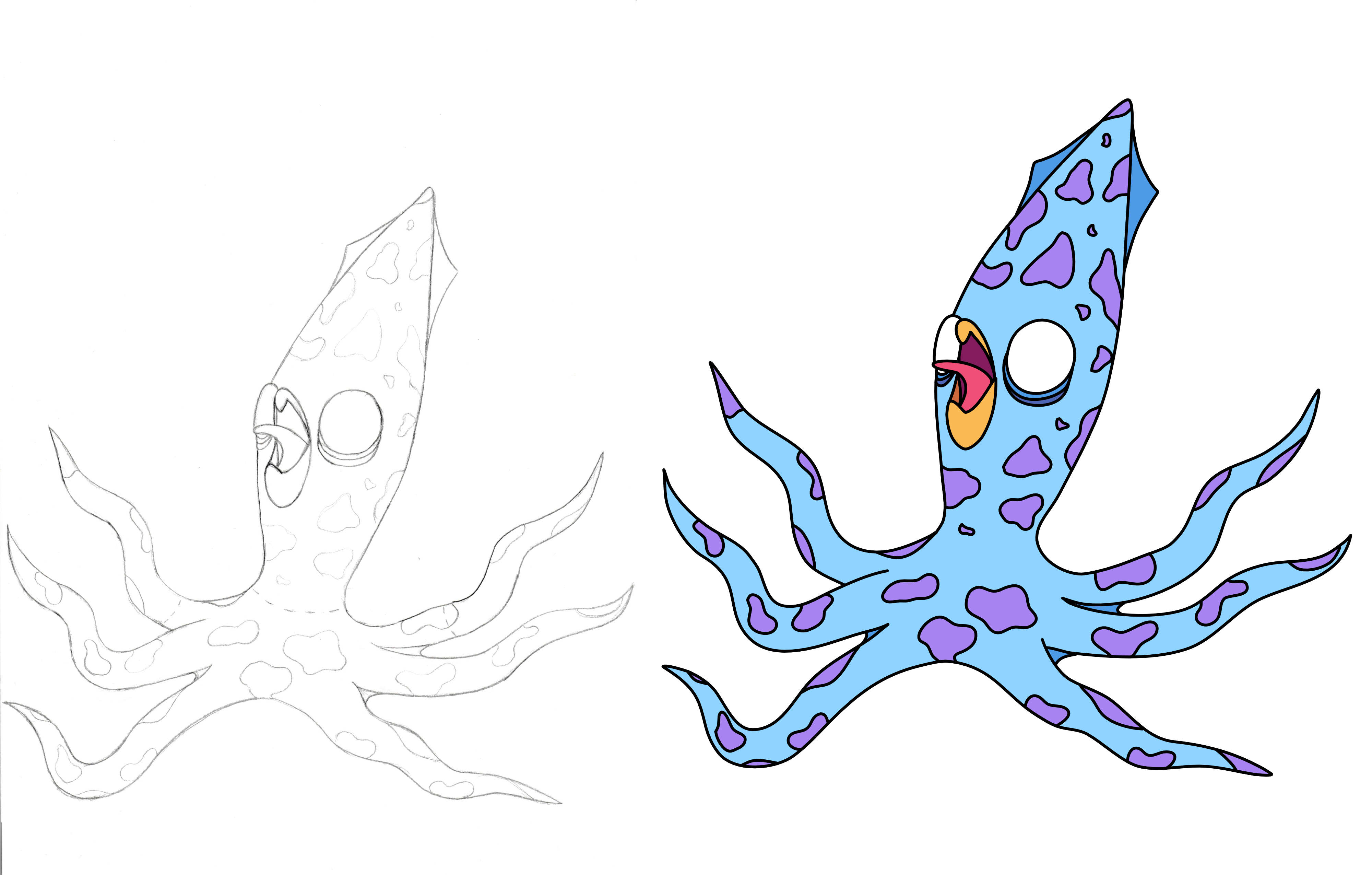
This project was interesting from an art side because it’s the first time my partner and I have worked on a project together. She designed and drew the monsters on paper, since neither of us are up to date on digital drawing techniques, and then digitized and colored those drawings on the computer. It’s a technique I’ve used once before many many years ago so it was nice to see it was effective here, if a bit slow since you have to re-draw the monsters on the computer.
Additionally, making the arms, legs, and torsos of different monsters connect together seamlessly would require a lot larger art ask, so we decided to do thick white outlines for each part and embrace the inconsistency, making it look a bit more like paper or stickers put together to make a monster and I think that ended up working well for the most part.
I was going to do the white outline as a shader, but I found the performance on HD assets like these was just too bad with Godot’s GLES2 renderer, so it’s pre-rendered into the source artwork.

Audio
The music for this game was tricky and overall I was a bit disappointed in it, but I think it works ok for the most part. We originally wanted to do battle music more akin to Pokemon or Final Fantasy but I had a difficult time getting the core composition to work so went with the backup idea of just doing a really heavy, grungy guitar riff to reenforce the idea of big, destructive monsters. Like I said, it works well enough here, but I’m not convinced it’s the best choice for the game.
The sound effects are all simple synthesizers from various VSTs I have, so that was an easy enough process, though I didn’t have time to record UI effects so the game is sorely missing the little clicks and beeps for button clicks and equipping parts and so on.
Polish
This is one of the areas of the game that I exceeded my goals on. It’s a pretty well established fact by now that polish is the king of making your game feel complete vs a prototype, and while I didn’t set out to make this game particularly polished (as perhaps evidenced by the lackluster tutorial), I did end up throwing a lot of simple tweens and AnimationPlayer nodes in this game to animate everything and make it a bit more visually interesting. The camera jumps when an attack lands, health and cash smoothly animate to new values, damage labels fades out, etc. I also used Godot’s built-in OpenSimplexNoise generator to add a slight sway to the camera and honestly feel like this was one of the largest bang-for-your-buck things I add. It kind of shocked me how much of a difference the “handheld camera” effect had on just making the game feel alive.
Misc. Technical
Lastly, this was the first time I made much use of Godot’s Resource class, and I’ve got to say that while it certainly was useful, it may not have been the best use case for this game. I used resources to manage stats and monster configurations, which made it easy to let the player purchase and equip parts on one screen and have those changes reflected in battle, but I do wonder whether a simple singleton in the form of an AutoLoad might have been better. Food for thought. At the very least, it was good to get exposure to a new-to-me Godot feature.
And that’s all I’ve got for today! Hopefully you got a few useful tidbits out of this.